Now I am afraid the writing of this blog post is a little overdue, due to my overwhelming commitments in my fashion design foundation course this past term. However I hope you all forgive me for both neglecting you (my lovely readers) and neglecting to report back from this very exciting graduate show, hosted by the University of Westminster. I was lucky enough to be invited to this showcase, after receiving my golden spotted ticket through the post rather unexpectedly. Now an envelope addressed to me always excites me, as the feeling of the unknown inside builds up the same kind of anticipation you felt as a kid when presented with a gift. So needless to say I was pretty excited when I open the envelope to see the invite. The show itself was held on the 24th May at the university's Ambika P3 gallery, where all the fashion elite queued in line to wait to see what the future of fashion held for them. And here is what it had in store ...
Hannah Duckworth
Previous work experience at Christopher Kane, Marios Schwab and Peter Pilotto.
This collection was one that had been boasted by the university, after splashing it's photoshoot all over the invites and runway magazine - making it a highly anticipated show. The show featured the elliptical shape of next season very prominently, with the dolmen sleeves and pointed hat accessories. With the strong silhouette also came the stronger colour pallet, full of bright, blocked colours. Hannah describes the inspiration behind this project as the "balance of clean graphic lines, strong silhouette and experimental colour pallet. Adhering to my innate minimal aesthetics, with rigorous attention to cut, detail and manufacture I want to convey my idea of sleek power dressing...for strong intuitive women with a slight masculine edge".
Poppy Totman
Previous work experience
at Felder Felder, Topshop and Clare Tough.
White may be the
colour of simplicity, but do not let this mislead you. The bold silhouettes and
intricate surface details are the prominent features within this collection,
which is designed for “A modern girl who is romantic yet autonomous” explains
Poppy. As well as the use of next season’s elliptical shoulders, the collection
adds the trend of contrasting textures – using delicate chiffons, waxed
surfaces and of course the roped embellishments. Poppy explains that the
collection was initially “inspired by the ‘Femme Fetale’ image throughout art
and film, enchanting but dangerous women from pre-Raphaelite art and romantic
poetry through to screen sirens of the 60s. The idea of the modern day version
of this woman became the muse for my collection. In terms of textiles and
shapes I looked at restrictive clothing built for purpose over design: corsetry,
strait jackets, armoury, turning functions into adornment”.
Lucy Upsher
Previous work
experience at Mary Katrantzou, Katie Eary, Christopher Kane, Jonathan Saunders,
David David and Norton and Sons.
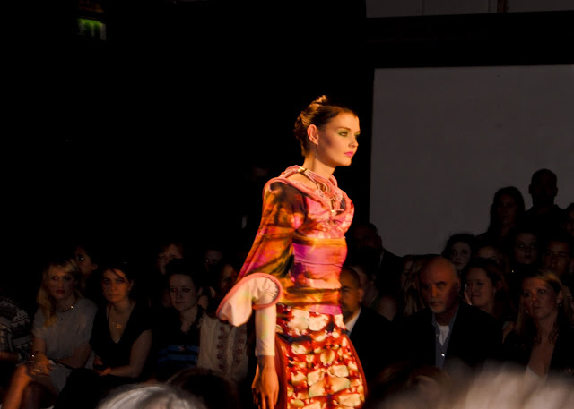
Digital printing
heaven. Katrantzou herself would be proud. This collection uses the digital
prints cleverly to intertwine the embellished textures that runs continuously
throughout the garments, using it to map out new contours and silhouettes
within. Her project was “inspired by the strange and spectacular structures of
the recent spider trees of Pakistan. I wanted to capture this almost explosive
amalgamation of energy and intricacy” – of which she does well through the
vibrancy and continuity of line. She goes on to explain that she “designs for
women who look for excitement and fun from fashion, where the risk and drama of
the clothing is unashamedly at the centre of its appeal”.
Daphne
Stylianou
Previous work
experience at Vasw Tranidou (Costume Designer), Emilio de la Morena and
Vauxhall Fashion Scout intern.
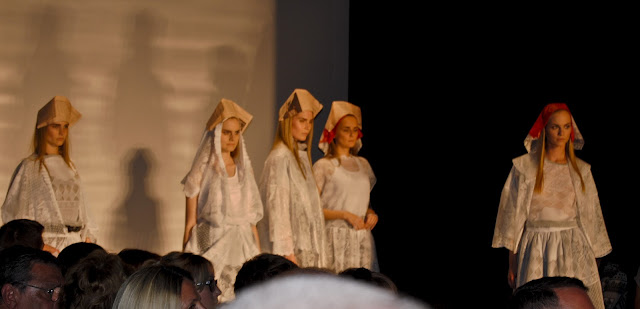
Daphne’s collection
was really one of great intrigue. The purity of the white and femininity of the
delicate lace, mixed with injections of fierce red was unlike any fashion
collection I have seen for a while. Perhaps her experience at a costume design
company inspired the edgy twist on her collection, but for me it was the cut
that said it all. As you will be able to see in more detail in a blog post I
will be doing very soon (about the graduates fashion designs and photography)
you can see that some of the dresses (third photo down) have a built in hooded
feature. Its little design details like this that really makes the collection
so interesting. When asked she said that her designs are for “women that don’t
exist in real life because it is less limiting that way” – a statement which
could really reflect her experience with the more theatrical, but also a
statement that I find close to my own heart! She also explained that this
collection was inspired by “Bertolucci’s romantic depiction of a cultural
revolution in the film The Dreamers supplies the nostalgic elements that
interact with a more structured and contemporary evaluation of today’s cultural
freedoms. The feminine fabrication and soft colour palette contrast with the
intensity of volume and sharp shapes. One of the main features becomes the
contrast of dark, thick and frayed wool with the draping of rigid, white lace”.
This woollen texture and the cultural references are two key features that will
also be prominent next season.
Meera Sharma
Previous work
experience at Jonathan Saunders, Angles and Asiana Magazine.
A great contrast to
the previous collection on the catwalk, but one with no less impact! The strong
colour choice, the strong silhouettes and the strong fabrics emphasise the
running theme of power throughout this collection. Her use of contrasting
fabric textures, weights and shine also fits perfectly with next season’s
collections. Meera describes the collection in three words as being “Sexy,
glamorous, superheroes” explaining that her collection “looks at the two layers
to these powerful women who often live double lives. The cut outs and the
contrast between the leathers, plastics and sheer fabrics represent this.
Straps, too, play an important part in my collection. Just as the superhero
changes her identity, the garments, which feature straps inside them, can be
pulled to change their shapes and thus be styled in a variety of way … [for
the] free spirited, fierce, sexy women who are not afraid to be themselves”.
Annie
Phillips
Previous work
experience at Leeane Soki Mak, Meadham Kirchoff, Charles Anastase and Cassette
Playa.
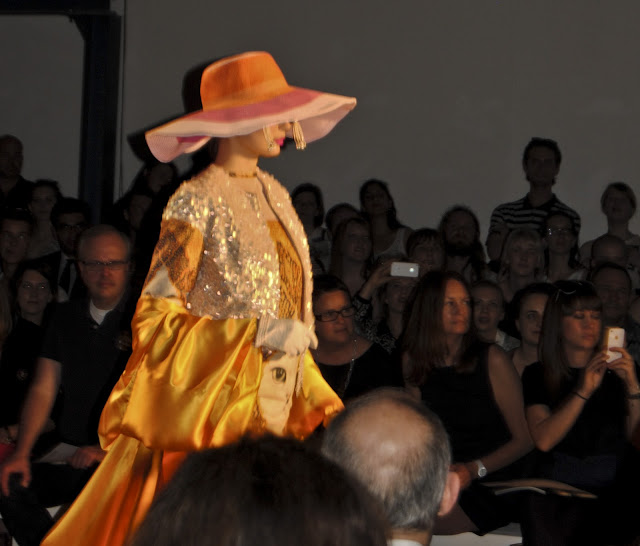
The first word I see when I open the
graduate’s magazine to Annie’s page is ‘GILF’ – the term is used in quite a tongue-in-cheek
way to represent what her whole project is about. The collection shows
inspiration from a bunch of fun-loving grandmas, who are living life to the
full, no matter what the restraints. It opened at the show with a flamboyant
grandma dancing and prancing down the catwalk to an eruption of cheers, sparked
by the great contrast from the previous young and serious models. This energy
really brought the collection to life with the right mood set. Annie describes
her inspirations as coming from “The eccentric older woman with style and
individuality, for example Iris Apfel, Edith Bele or Barbara Cartland, and how
they enjoy dressing up for fun and playfulness as opposed to sex appeal. This
collection aims to destroy idealised beauty and create an old charm by layering
textures; Baroque and Zen, or patterns ethnic and contemporary and make them
work together as though one of these fascinating women is wearing her life of
fashion in an amusing, light and joyous way”. Some of her designs do have a
slight Prada touch, and that does make me ponder if that could be a possible
future for Annie to work for the design house, however her dream is naturally to
have her own job, designing for “an uncompromising but never uptight nor fussy
woman with a sense of humour – the look overall has a kind of ‘throwaway chic’
vibe. I design things I like and incorporate things that amuse me”.
Catherine
Bell
Previous work
experience at Hermione de Paula, Topshop Unique and Le Flux.
This collections is formed of whites,
texture and depth, to create a simple but very dramatic effect. Plus the white
colour pallet and contrasting textures are very in keeping with next season’s
trends. I particularly like the lined textures and chiffon overlays. Catherine
describes the thought process behind her collection – “Taking inspiration from
the bare white wild abyss of the Arctic, the beauty of the twenties and the
structure of Inuit silhouettes, the collection hails the inner ethereal woman…
[designing] for the woman that exudes femininity, keeps secrets and appreciates
the little details in life”.
Nina Lee
Lauritzen
Previous work
experience at Alexander Wang, Mulberry, Chanel and Ann-Sofie Back/Cheap Monday.
Strong in line, texture and geometric
shapes. Once again the contrasting textures running through this collection
makes it very fitting for next season’s trends, as well as adding some dramatic
impact to the collection. Nina explains “my main inspiration is based on the
Austrian painter Egon Schiele, whose twisted body shapes and expressive lines
inspire the shapes and colours of my collection. I also looked at upholstering
of furniture and applied these techniques to the body, which I then contrasted
with the use of modern fabrics… [designed for] effortlessly chic women”. I can
definitely see the use of expressive contour lines within her collection, which
makes it extremely strong.
Charlotte
Righton
Previous work
experience at Liberty London and Meadham Kirchoff.
Dainty florals, delicate chiffons and sorbet
pastels; this was a collection that was not only the definition of spring, but
also looked good enough to eat. The ultra-feminine garments would have the
McQueen SS12 collection proud. Charlotte described her collection as being “inspired
by the dusty humid colours of forgotten summers, heartache and longing, and
girls who are fragile, unconventional and androgynous. The delicate beauty of
dress in the early 20th century combined with the lurid explosion of
nineties grunge culture. A tactile collection of luscious ruffles, ornate
detailing and unusual fabric combinations…[designing for] romantics, who are
awkward, unforgettable and nostalgic”.
James Burrow
Previous work
experience at COS, Charlie Le Mindu, Stefan Orcheal Read and Todd Lynn.
I may not be the most knowledgeable when it
comes to menswear, but I do know that this collection is very innovative in the
field – with its use of pattern cutting in particular; it uses lengthened
shirts and caped cuts to give the collection an edge. James describes “The
inspiration behind my collection is from Christian leaders in Eastern
Countries. I also have a somewhat disturbing obsession with men in skirts,
there’s something incredibly sexy about a guy who’s man enough to be
dangerously effeminate”, he continues by telling us that his designs are for “not
quite your average Joe, but certainly no super-man either”.
Ciara Ip
Previous work
experience at Meadham Kirchoff, Hussein Chalayan and Gareth Pugh.
‘Theatrical’ would be a good word to
describe Ciara’s collection, with its bold colours, contrasting lines and
expressive movement when worn. With designs inspired by “Contrasts – tailoring,
tulle, bitter brides and sinister schoolgirls” this collection even opened with
a piece of menswear to contrast with the rest of it’s womenswear. Ciara also
explained that she designs for “people who want to make a bit of a statement”;
well this collection certainly did, with its long, flowing hems made from such
luxurious chiffons.
Ashley Williams
Previous work
experience at Fran Burns, Love Magazine, Arena Homme +, Nasir Mazhar, Jeremy
Scott and Beat Magazine.
I think this may have been one of my
favourite collections, as it played to the animal loving girl that I am. Opening
with the CUTEST puppy in the world was
adorable bribery to get the audience into an immediate fun loving mood, with
the uplifting, vintage styled garments continuing this on. I particularly loved
the first outfit and third dress (of which I now really want to purchase
too!!). Ashley describes the inspirations behind the project – “The initial
inspiration was American oil tycoon heiresses and Texan divorcees. These ideas
developed as I explored making my own prints and although some of the prints
appear to look very different you can still link them to each other coherently
through my muse of playful Americana” adding that when designing “I don’t
design for anyone in particular but I would never make something that I wouldn’t
want to wear”.
Alexandra
McGrady
Previous work
experience at Proenza Schouler, Alexander McQueen and Agent Provocateur.
Once again, menswear is not my forte, however
that does not mean it does not intrigue me, in fact, in some ways, it intrigues
me more, as its an area of fashion that I know less of. The thing that intrigued
me most about this designer – who had previously fulfilled work experience at a
design house that I truly admire (McQueen) – was the use of such strong cut
within the garments. Alexandra explains that “Miners and workmen from North
East England inspired my collection. I grew up in Newcastle Upon Tyne where the
mining and shipbuilding industries were central to the identity of the city and
its people. My main focus for the collection was to look at the heritage of the
North East and create modern clothes, whilst keeping traditional elements… [designing]
for a confident, modern man, aware of his surroundings and interested in
culture”.
Claire Barrow
Previous work
experience at Claire Barrow (starting up her own label and in doing so working
with/for UK Vogue, i-D, Dazed and Confused, V, Elle, Arena Homme +, Dust,
Underground Shoes, Joseph and Rihanna).
Now you may recognise this graduates name, as
she has not only designed for Rihanna on both her ‘Loud’ tour and ‘Talk That
Talk’ Album back cover, but has also succeeded in launching international
collection in London and New York with Joseph in their flagship stores. This
collection was none the less dramatic; she explains “The collection, featuring
garments completely made from acrylic paint, pays homage to the mistresses of
the surrealist movement and their sexual encounters with the famous male
artists of the 1920s. Using menswear staples as a starting point, the
collection is a concoction of unisex garments inspired by art and delivered
with my DIY aesthetics… I [also] want every collection to bare my soul as if I
am creating my first album”.
Xenab Lone
Previous work
experience at Alexander Wang and Richard Nicoll.
You may of gathered by now that I am obsessed
with the cut and lines within garments, so this collection (although not fiercely
tailored like I normally go for) really says something to me with its bold and
powerful silhouettes. Xenab explains “My collection was conceived when I went
to an exhibition of the Neo-Concretist artist Lygia Pape. I have always had a
fascination for the simplistic line qualities that she uses in her work, which
are juxtaposed with heavy opaque blocks of colour. I wanted to create a
silhouette that would also echo this. I like the idea of feminising
traditionally masculine shapes and wanted to create a structural formation
around the female form. Tailored pieces that include heavy cashmere bonded with
neoprene overcoats and structured shoe leather dresses with the sports luxury
ideal in mind, form the basis of this collection… designed for a woman who
embodies dominance and strength, a woman who wears minimal, timeless pieces
with a contemporary fashion forward slant”.
Aiden Weaver
Previous work
experience at Gallery 4, Alexander McQueen – McQ and House of Holland.
This was another
collection that stood out for me and of course that had absolutely nothing to
do with the male Adonises underneath. It did in fact have to do with Aiden’s
use of transparencies and use of depth within the layerings and textures. Aiden
explains “Durability, functionality and protection are central to the needs of
a rock climber’s attire. I was drawn to the air of severity and masculinity provided
by such essential clothing to the male athlete in the field. In juxtaposition
to this relationship between garment and body I used elements of a classic
sportswear silhouette in my design aesthetic. Inspired by the physical
extremity of the sport the use of bold graphical colours result in a high-end
desirable menswear range… full of attitude and masculine radiation”.
Adam Jamieson
Previous work
experience at That’s Not Fair, Graeme Armour, Katie Hillier, Matthew Williamson
and Alexander McQueen.
You can definitely
see the learning curve Adam has been through from working at highly acclaimed design
houses like Williamson and McQueen, as his collection had to be one of the most
extreme and elaborate within the show, taking next season’s texture trend to
the extreme. He explains “I have been inspired by excessive gift wrapping,
Christmas and sweet wrappers, rammed through a paper shredder… I design for a
fun, sassy and outgoing woman who has an experimental style”.
And who did I spy when taking the photographs of the collections, only Central Saint Martin's Willie Walters (bottom left) talent spotting from the new graduate's collections.
Jessica Walsh
Previous work
experience at Marc Jacobs, J. W. Anderson, Victor & Rolf and Meadham
Kirchoff.
The final
collection to be shown on the catwalk was a large collection of mens and
womenswear, with a sharp colour pallet, rich embellishments and strong cuts and
silhouettes. Jessica explains “Couples, menswear and womenswear design with
research that references androgynous feelings with undertones of religious dress
and illusion. Embellishments and prints define the mood and tone of the
collection with leathers, printed organza and beaded jersey… for men and women
without stereotypes, and for those that get bored easily”.
And that's a wrap. This post has taken 6days 14hours and about 32minuites to complete (with write ups, research and editing) so I hope you enjoyed it and got a taster for the talent coming out of Westminster.


